CASE STUDY
Etax.center is a comprehensive tax filing platform that allows its users to file their taxes online, with human intervention.
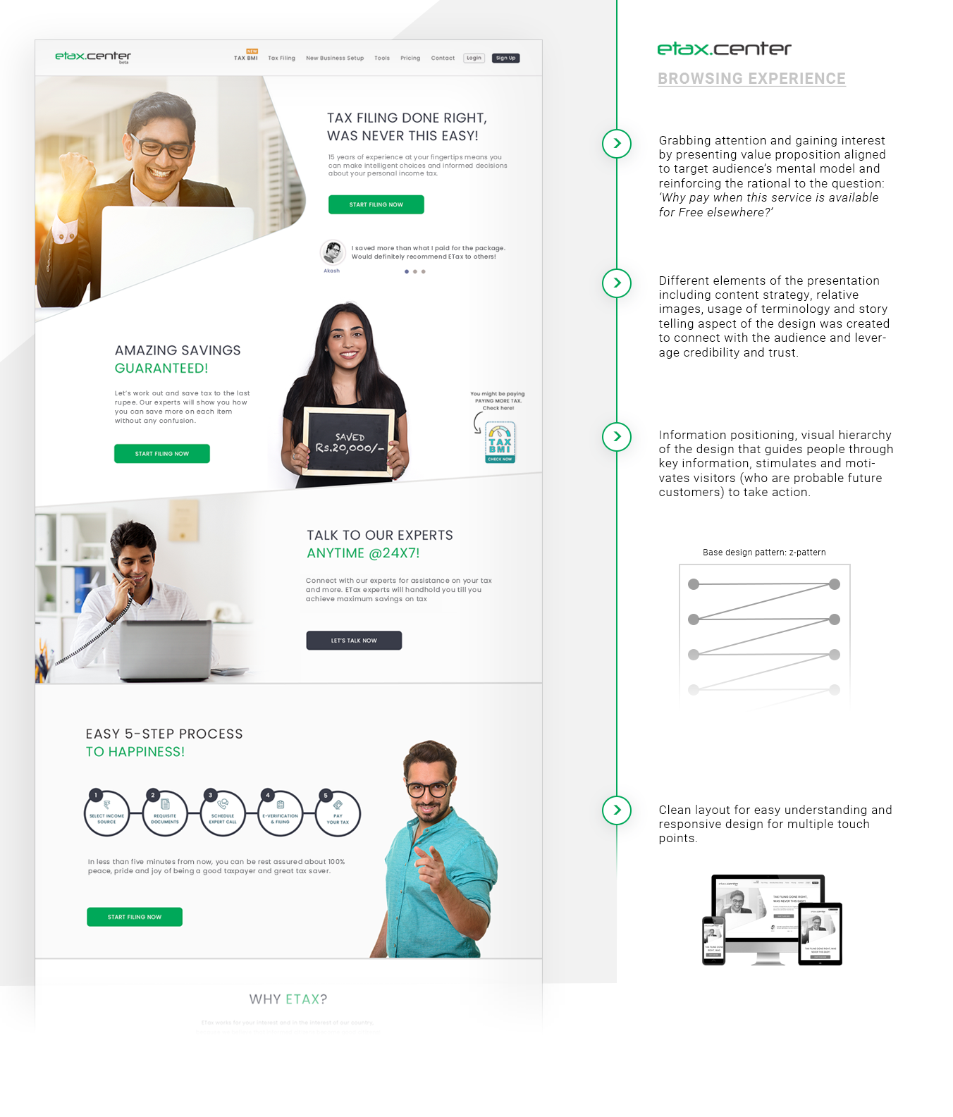
In this overcrowded space of online tax filing services where almost all competition offer users to file their taxes for FREE, Etax's proposition to provide only a paid service to their customers, for the same was a challenge in its own way. The challenge was 2 dimensional. One - creating a landing page that would act as a situmulant and motivate users to take action and Two - maintaining the perceived expectation by extending trust, usability and satisfaction throughout the user's journey of using etax's online filing application and completing their tasks without any cognitive overload.
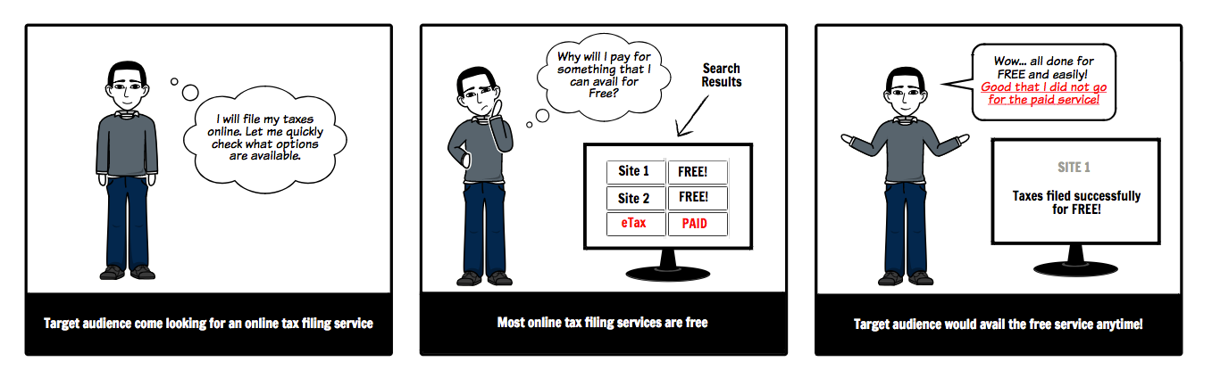
General perception of audience when a paid service is positioned against a free service
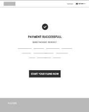
The first step - A UX strategy for the website had to be designed that would motivate users to take an action and help in conversions, while aligning it with the user's mental model and the business proposition.
Building up the trust and making target audience (who are also probable customers) understand the value of the offering (though paid) was extremely important for proper impact and conversion.
Given the context, we approached this design challenge working on UX psychology to motivate a behavior change. A deep connection with the brand and product was required for 'Etax' to compete with it's competitors, hence a combination of emotional and persuasive design was required to create a meaningful experience.
Emotion plays a very important role in decision making and human brain's visceral level of perceiving a product, i.e. the first impression of design that grabs the user's attention which also affects the perception of a product or service's credibility, quality and trustworthiness, had to be addressed.
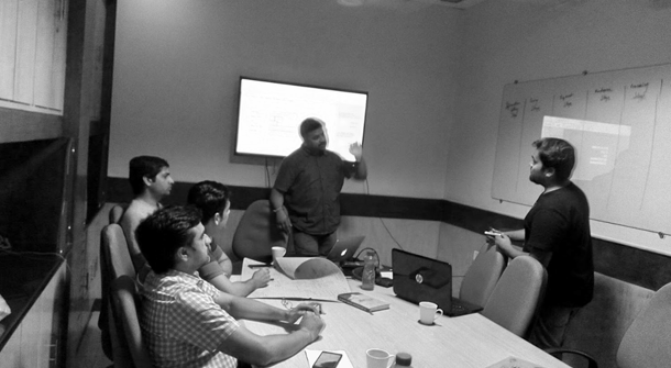
Stakeholder workshops were conducted to understand their value proposition, vision, goals and users. With other multiple workshops giving us an understanding of the offline process, a major part of which now had to be transformed online, we started off with competitor and user research.
Empathising with the target audience, understanding their behavior, needs, wants, expectations and problems, we moved into the conceptualization phase driven by insights.

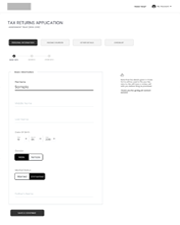
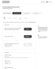
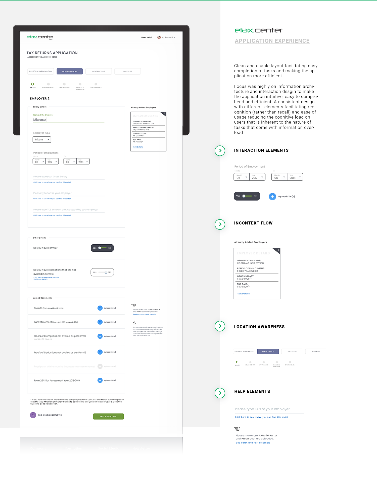
It wasn’t only about the homepage of the website that needed to instil trust among the target audience (to an extent that they pay for a service that can be availed for free elsewhere) and help in conversion but also about the tax filing process to be used by them that was being digitized. Holistically, it had to be intuitive, coherent, addressing key challenges, efficient and highly usable reducing the immense cognitive load that users face due to information overload while filing taxes online.
Intuitive workflow, interaction design and content strategy were addressed in the conceptualization phase.
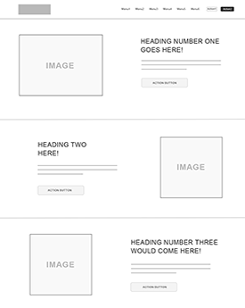
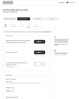
Based on the unique strategy contextual to their business, keeping users at the core, the task of simplifying the complex application of tax filing process was attained with iterative design approach and user testing. Interaction design played a very important role in attaining this.
After multiple iterations and refinement, the final flow was ascertained.
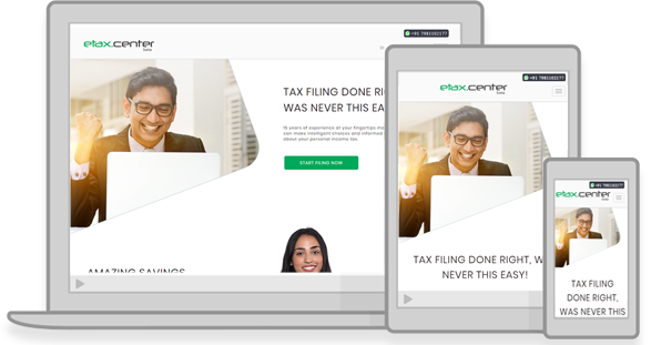
With the belief that your website needs to connect and talk to your customers, we got to applying UX work into action - visually.
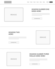
Special care was taken to make sure the visual elements used were in alignment to the UX strategy. Brand colors; images reflecting target audience that users can relate to; visual hierarchy of terminology and phrase construction to drive user to perform an action; positioning of content sections etc. were addressed while making it look visually appealing and simple.
We have been working with Dotweb closely throughout the project which has enabled him to increase their online sales by almost 85%. The strong focus on UX and user journey helped in higher site performance in terms of usage and conversions.

sameuletax.center